


ImagineMe Mannequin Contest 2014
Created in 2010, this mannequin art competition is designed to promote healthy awareness and acceptance of body image. iaedp invites national art therapists from treatment centers and private practice, students and the public to artistically create mannequins that reflect their perception of beauty and body image.
Judging Criteria
Mannequin entries are judged on clarity of theme, creativity and originality, quality of composition and design, and the overall impression and presentation of the artwork. The contest is open to everyone; however, iaedp encourages treatment centers and private practices with art therapists to work with patients to provide entries.
Each year, poster images of the mannequin entries are displayed gallery-style at iaedp’s Annual Symposium. The Winner, Runner-Up, Honorable Mention and Professional’s Choice are awarded during a special ceremony. The winner receives a financial award along with the image of their mannequin being used in Imagine Me Beyond What You See™ promotions throughout the coming year. For the awards ceremony, the winning mannequin is shipped to the Annual Symposium, unveiled along with the artist(s) and later auctioned off with proceeds to benefit the iaedp Foundation.
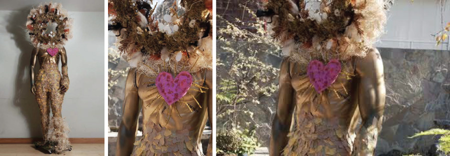
Winner, The Lion’s Journey
Artist: Bella Vita Eating Disorder Treatment Center/CA
Joseph Campbell’s monomyth, The Hero’s Journey, inspired the creation of “The Lion’s Journey”. In our male representation, the individual embarks on a voyage ultimately leading to his transformation into the courageous lion that has been there all along. From man to lion, The Hero’s Journey, shares close resemblance to the incredible strength and courage one has within to support the tasks and challenges that it takes to move beyond an eating disorder.
The Hero’s Journey is a pattern that can be found in mythology from a range of cultures. A few common stages found in the Hero’s Journey include: a call to adventure, challenges and temptations, revelation and transformation, crossing the return threshold, and freedom to live by reconnecting with one’s wholeness. Clients used this pattern to create narratives of their own journeys of recovery.
During the transformation stage, clients discussed the metamorphosis of a human into a lion and lioness that lies within each of us:
Pride, courage, and strength describe qualities of a lion to access in one’s recovery. Battling an eating disorder takes the mightiest of all fighters, which can be represented by a lion. A lion is the king of the jungle for its greatness, strength, and confidence. The legs on a lion or a human represent the kind of journey, the skills utilized and the end result. Recovery can be a long road; but in the end each individual is stronger and now prepared to fight any battle that may come one’s way.
Nature wraps around the lion’s left leg, representing the importance of being more grounded, aware, and mindful along the journey. Finally, the affirming heart with golden rays was placed on the lion’s chest to reflect the growing courage and confidence in oneself; an inevitable outcome of the journey to wholeness.
Materials:
Special thanks to PLACTbros.LLC for making the donation of the mannequin. Clients used strips of newspaper to paper maché the legs, in order to create a realistic vision of a strong and powerful lion. Shredded pieces of brown and gold paper were individually applied to create the impression of fur. The left hand on the mannequin was replaced with a lion’s paw, including claws ready for battle and protection. The lions’ mane consists of moss, feathers, hay, gilded leaves, and other nature inspired materials. The foundation of the mane includes styrofoam, pipe-cleaners, and large nails.
Artist Profile:
Clients from The Bella Vita Eating Disorder Treatment Center in Los Angeles brainstormed and worked together to create, “The Lion’s Journey.” Program Therapist and Discharge Planner helped facilitate the clients’ creation during Body Image and Art Expression groups. During these groups, clients were able to process their thoughts and feelings embracing a deeper appreciation for the many ways their bodies serve them.
Meat Sculpture
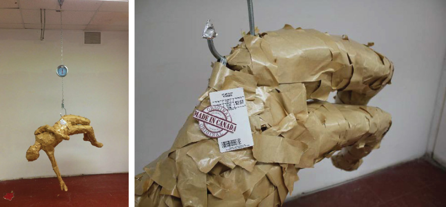
Artist: Sydney Lanteigne – Canada
When my piece, entitled “Piece of Meat” was viewed in a class critique, the response I received was exactly as I had intended. In people’s first reaction to the sculpture, they knew that I wanted to express something seriously wrong in society, and needed to be put into question. A few people thought it was about human trafficking, or gender stereotypes, but after more critical examination, its true message was quite clear. The full-sized figure is portrayed as a brown-paper wrapped object (made with body-casting techniques) that resembles a packed piece of meat, the kind you would buy at a grocery store or butcher shop. The figure hangs from a large metal hook, supported by an industrial chain that is attached to a large circle-faced scale. All in all, the sculpture implies the idea of the meat industry, except rather than beef hanging; it’s a human form. This message is reinforced with two stickers on the hip, referencing meat company packaging. One of these stickers says, “Made in Canada”. I added that detail to imply the faults Canada has in regards to societal health. This is because despite that fact that Canada has so many wonderful systems like good health care, living standards, even meat regulation, we also fabricate a horrible mental disease. It is social stigma that is destructive to peoples mind, body and soul, and is only present in first world countries like Canada or the USA.
All in all, the sculpture is saying in this culture, sometimes we treat our bodies not as the amazing, powerful, and beautiful vessels they are, but as meat. Where only its weight has value, and is “produced” to be consumed. In my sculpture the form lounges back in an accepting manner, gazing upward towards the scale, ignorant to the fact that its hip is being gouged out by the same object. The mood portrayed by my sculpture is brutal, but it is also elegant, and sadly beautiful. The carnage of the imagery is balanced by the graceful form of the figure, giving it a sense of eerie truth about the issues surrounding eating disorders.
Materials:
Metal chain, Packing Tape, Cling wrap, Masking tape, Metal Fixtures, Paper print-outs, Hot glue gun, Newspaper, Metal Tape, Industrial hook
Artist Profile:
My name is Sydney Lanteigne. I am a student attending my first year at the Alberta College of Art and Design in Calgary, Alberta, Canada. I have been battling with an eating disorder for 3 years now, and the experience has been a major inspiration for me in how I perceive the world, and the art I create.
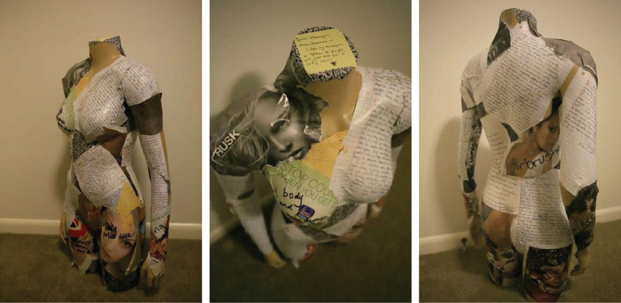
Is This What Recovery Looks Like?
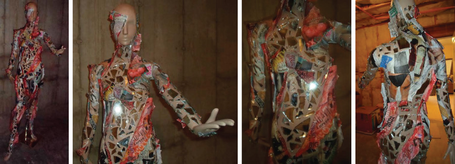
Artist: Center for Discovery New England – CT
“Is This What Recovery Looks Like?” was inspired by the juxtaposition between thoughts about how one should look, act and feel versus how one perceives he or she actually looks, acts and feels. In the process of working towards recovery, one obstacle is to overcome is this perceived contrast. The mannequin is shedding the shell that encapsulates her in her disorder. The outer portion of the shell is covered with images, words and quotes representing how she feels she should be, while the inner portion of the shell is covered with images, words and quotes that represent how she feels about herself (this is the juxtaposition that is imposed on her by her eating disordered inner voice). The outer portion is glazed with gray paint to dull the color and life from the images, while the inner portion is glazed with red to represent the pain and struggle that she feels. The mannequin’s body is covered with shattered mirrors. This forces the viewer to reflect upon him or herself in the disjoined way in which one with an eating disorder often views herself.
Materials:
Paper mache, collage, acrylic paint, mirror pieces and glue
Artist Profile:
Kathryn Farrell works as a Dietetic Technician at the Center for Discovery in Southport, CT. CFD is a treatment center for adolescents with eating disorders. Kathryn has a Bachelor’s in Fine Art and is working on earning her Registered Dietetic Technician credential. After struggling with an eating disorder for half her life, she is finally in a happy and healthy place. “I wouldn’t say that I am ‘in recovery,’ but I would say that I am smarter and stronger than my eating disorder. Through art I found confidence and courage, and through nutrition I found knowledge and power, but more importantly, my new life.” Kara Donovan works as a counselor at Center for Discovery in Southport, CT. Kara works with adolescents with eating disorders. Kara is currently pursuing her Master’s Degree in Marriage and Family Therapy.
Just Breathe
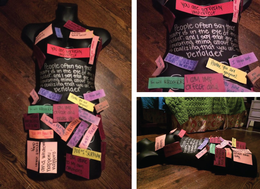
Artist: Hunter Benson with Art Therapist Eva Miller/Carolina House, Raleigh, NC
I went to treatment for a year from June 2012 – May 2013 and collected affirmations during that year. Some of them were written by others and some were written by myself, but all have the same underlying message. It can be hard to slow down and enjoy life, especially with an eating disorder plaguing your ability to do so.
I wanted to add affirmations because now when I look at myself, I don’t automatically assume a negative perception. I have learned to slow down and to enjoy life more because you only have one. I wanted to look at this mannequin and see love and health, something that inspires me to do the same for myself.
The affirmations not written by me also emphasize how connected and safe you are around the people you love. These affirmations were written by girls I met while in treatment and have given me support and love even now that I am not in treatment anymore. I know I am never alone in life, and that is what these affirmations represent.
Materials:
Mannequin, Paper, Marker, Sharpie, Tape
Artist Profile:
Hunter Benson is a college student in North Carolina and spent a year in residential treatment at Carolina House. She is in recovery and is planning on using her own knowledge to give back and help others who are still struggling.
Art Therapist Eva Miller was instrumental in helping this vision come to life. Hunter had worked with Eva previously at Carolina House and continues to work with her on an individual basis at her studio, Triangle Art Therapy in Raleigh, North Carolina.
Frustrate
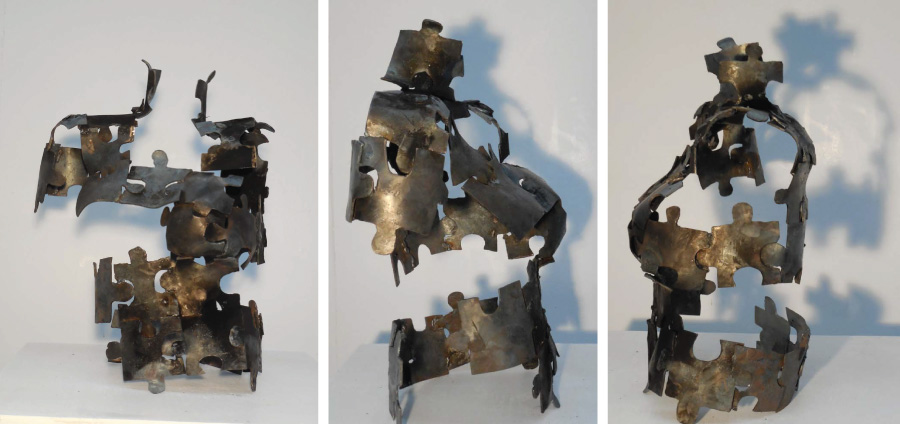
Artist: Rebecca Tishman – MD
Frustrate /ˈfrəsˌtrāt/ verb prevent (a plan or attempted action) from progressing, succeeding, or being fulfilled. The frustration of never fitting into the form. It’s about the vulnerability of constantly recreating ourselves and altering who we are in pursuit of figuring out our identities. Taking the bits we are handed and making them fit to what we perceive ourselves to be. The trials and tribulations of growing up and experiencing traumas. Different life experiences that leave their marks. Fitting together what I can to create some semblance of a being. The whole is greater than the sum of the parts. Constant confusion muddled thoughts. I’ve formed my identity from the experiences I’ve been given.
This piece went through several stages of development much like each one of us does. I started by cutting puzzle pieces out of a large piece of sheet metal. I then forged and hammered each piece to fit over the mannequin form. Welding them together around the mannequin I created a new body using the mannequin as a means to an end rather than an end in itself.
Materials:
Steel
Artist Profile:
I am interdisciplinary artist working primarily in metal, writing, and performance. I am extremely excited to be celebrating my five-year anniversary of recovery from my eating disorder. I strive to spread education and awareness around eating disorders and other struggles through my art.
Hear Me Now
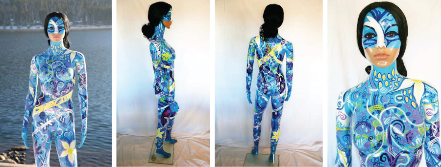
Artist: Erika Noble, The Renfrew Center of Florida, Karen Polin, BFA, ATR, Clinical Art Therapist
In painting this mannequin, I am portraying the following message: Even though her body is beautiful, intricate, interwoven, colorful … her beauty and strength are nothing in comparison to the voice within, which is why the mouth of the mannequin remains realistic.
The lyrics from the following song, ‘The Time is Now’ by Warren Barfield, clearly convey what I have learned in my recovery journey and mirror what I have created with this mannequin.
“… You can’t buy my silence, you can’t steal my voice. You can’t keep me quiet, I will bring the noise. Try to beat me down, tell me to shut my mouth, but there’s a time to speak, and the time is now. This world’s gonna see what I am standing for. I’ve kept my peace; I can’t hold my tongue anymore. I’ve been sitting still. Always tip-toeing trying not to wake the beast, oh but here I come, all you monsters had better run from me.”
What I have learned at Renfrew is that I am more than just a body or a number; I am me, I have a voice and I will use my voice, not my body, to be heard.
Materials:
Mannequin, wig, gesso, liquitex professional spray paint, acrylic paint, rust-oleum shimmer enamel spray paint
Artist Profile:
Erika Noble lives in Reno, Nevada, and is in recovery from a life-long struggle with anorexia. She began her recovery journey at the Renfrew Center of Coconut Creek, Florida, in 2010, where she rediscovered her passion for creating art. She currently uses painting as a primary coping tool and a method of communication to those around her.
Karen Polin, BFA, ATR has been a Clinical Art Therapist for 41 years. For the past 13 years she has provided Art Therapy group and individual sessions for The Renfrew Center of Florida, where she worked closely with Erika to help her find her voice through her amazing artwork in her journey to resolve her eating disorder.
Broken Open
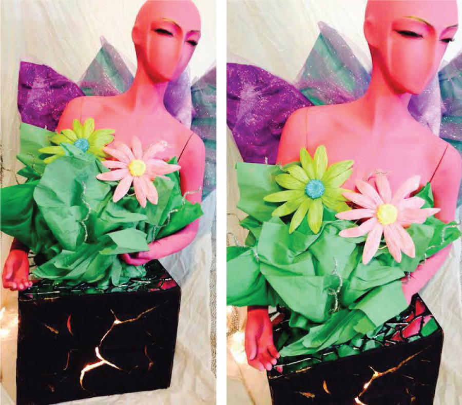
Artist: Project Bliss – TX
This piece of artwork is a representation of the positive life change that can emerge from very difficult life events. During times of transition or when we face adversity, life offers us a choice: to turn away from change or to embrace it. To shut down or to be broken open and transformed. The base the mannequin stands on displays the distractions, chaos, suffering or struggles life will hand us to make us broken. Instead of letting that bring us down, we find empowerment, and growth within the brokenness to turn the negative into the positive, which is displayed by the colorful and life-full part of the artwork. It is all about the design or disaster turned to step boldly into a fuller life; how we resist and how we surrender, how we stay stuck and how we grow, and how we can turn misfortune into insight, and grief into joy.
Materials:
Acrylic paint, poster board, tulle, pipe cleaners, tissue paper, hot glue gun, broken mirror pieces, Christmas lights, cardboard box, tape
Artist Profile:
Project Bliss is a non-profit 501 (c) 3 eating disorder facility in Arlington, TX. Aside from treatment, we are also dedicated to spreading education and awareness in our community. Two of our wonderful volunteers, Andrea Lopez and Sawyer Wright, created the mannequin based off an idea from Jennifer Pereira RD, LD, LPC-I and Director of Project Bliss. Andrea and Sawyer are juniors at a local high school, and have been highly instrumental at Project Bliss.
My Body is a Gift: Stepping outside the Box and Looking beyond the Surface
Artist: Eating Disorders Program (EDP) South Vancouver Island, B.C.-CANADA
Our objective was to use the process of transforming a mannequin from idealized to real as an opportunity for client insight and change. Our mannequin appeared pre-pubescent so, using papier mache, we created a form more representative of the average woman. Next, participants applied anatomical images to the body and/or filled the boxes with anatomical images decorated with their responses to our guiding questions.
Inspired by our program’s philosophy we chose three themes: awareness, mindfulness and gratitude. Our directive was to look beyond personal appearance: the anatomical images applied to the outside of the mannequin reflected this. We spoke of being “appreciative of my heart and how it beats, and also my heart and how it feels and works for me.” Clients connected with what their bodies can do: ‘My strong legs help me move around’ and ‘My arms lift my child’. Mind and spirit were also considered and guiding questions included ‘What is it that you wish people would see first about you beyond your physical appearance?’ and ‘In what way is your body a gift?’
Participants created artful responses to these questions, and placed these in the boxes:
On a hand… My hands are a gift: They can hold a baby, make food for a family, sense a fever, soothe a pet, play music, touch a loved-one’s arm, record history.
On a foot… These feet, sometimes in slippers, mismatched socks or six inch heels, carry me through the good, the bad, the beautiful.
Our mannequin evolved into a metaphor for seeing beneath the surface. Engagement with the project influenced clients and professionals alike to make a personal and joyful connection with the ways in which their bodies are a gift. We’re thrilled that our project has sparked similar initiatives around the province, inspiring recovery and health farther afield.
Materials:
Paper mache
Artist Profile:
“My Body is a Gift: Stepping Outside the Box and Looking Beyond the Surface” is a collaboration between professionals and clients from the Eating Disorders Program (EDP) South Vancouver Island, B.C., and from throughout the province of B.C. The body of the mannequin was first reshaped by clients and therapists at EDP in Victoria and then the “work in progress” was taken to the Community of Practice for Eating Disorders for B.C. conference in Vancouver. It was presented to the conference body and they then added to it.
Self Arising
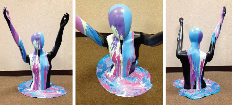
Artist: The Recovery Village ED Group – FL
The group has been involved in an art therapy journey working with the theme of the ocean and based on Margaret R. Hunter’s book “Reflections of Body Image in Art Therapy.”
The torso mannequin was chosen so the drip technique would create the idea of the figure emerging from the water. Eight colors of latex paint were selected. The mannequin was placed in a circular drip pan. Paint was poured on the top of the mannequin, color after color, creating the drip effect. The group wanted a bold and simple design to make their point.
At first It felt like drowning, sinking in deep into different layers of my addiction. Then, slowly, I felt myself rising from the depth. I have a new understanding of my emotions, and a grasp of the 12 steps. I am trusting and capable of going with the flow, allowing a higher power to influence the direction of my life. A change was beginning within me and around me. It is only though emerging that I could experience all the layers of myself. When I broke the surface, hands outstretched to the sky, I felt hope. I can tread water. The waters are clear and calm now, reflecting inner peace, inner balance and harmony. This new me is not over-controlling or under-controlling, and has positive feelings of joy and happiness. I can overcome any obstacle. I am limitless on my life’s journey.
Materials:
Mannequin, 8 Pantone Universe Colors of latex paint
Artist Profile:
Two clients (a male and female), from The Recovery Village Eating Disorders Group worked on this expression along with Marnita Patton, MA, ATR, CCBT, CGT, CDP, Art Therapist. The Recovery Village offers comprehensive treatment for dual diagnosis based eating disorders, substance abuse, and mental health treatments.
She Flies With Her Own Wings
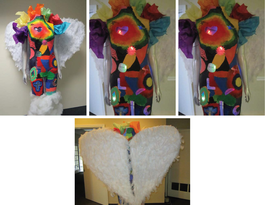
Artist: Blue Horizon Eating Disorder Services – FL
“She flies with her own wings” was conceptualized, designed and created by members of the Blue Horizon Intensive Outpatient Program, as a part of the healing and recovery process. Each patient had the opportunity to design a cut-out shape to represent their own personality and life experiences. The light shining through the shapes allows us to truly see the beauty of all shapes, illuminated by the inner light shining within us. The exterior form and coloration of the mannequin was created by over 15 artists over the course of several weeks. Individual participants were able to come together as a community to create something both beautiful and inspiring by using their own artistic abilities and styles.
Her wings were created to represent the recovered form taking flight, which she is able to do once she allows her inner beauty to shine through. The words illuminated by the mannequin’s inner light represent different aspects of our own inner beauty, as well as the strengths that will guide us into full recovery to find peace free of the eating disorder.
Creative Process:
A weekly therapy education group from Blue Horizon’s IOP designed and built this mannequin. Patients worked together to create a unified idea for what the mannequin would look like and how she would be built. Over the course of several months, groups worked on the mannequin first to build her form, then to design shapes for light to shine through. The mannequin was then painted; the wings were built, feathered and assembled. Finally, group members worked to select a color and a word to represent their own recovery and healing process before re-assembling the mannequin into the artwork it is today.
Materials:
Mannequin, paper mache, cardboard, acrylic paints, feathers, cellophane, glue, sharpie, strung lights, tissue paper, glitter spray, poly-fil
Artist Profile:
From start to finish, this mannequin was designed and built by the patients of Blue Horizon. She represents the diversity of our patient population, life experiences and the range of emotional and physical process that patients experience during recovery. It is our hope that by finding such beauty in the healing process, we will inspire and motivate others to reclaim their health and their lives in full eating disorder recovery. The process was overseen by the registered dietitians and therapists of Blue Horizon Eating Disorder Services.
Girl Power
Artist: Veritas Collaborative – NC, Karen V. Kuebler, MPS, ATR-BC, LCAT
“Girl Power” was created during weekly art therapy groups on the Adolescent Partial Hospitalization Unit at Veritas Collaborative. Group members utilized the blank canvas of the mannequin form to promote positive body image and to explore their emerging sense of self as a group and individually.
The group members chose to divide the mannequin into two halves to emphasize the contrast between cultural pressures related to beauty versus their own developing ideas about celebrating the female body. The right side of the mannequin is blank with only a few plastic surgery lines to represent society’s pressure to alter the body. In contrast the left side of the mannequin is filled with their own words, positive body image quotes, and designs. As the group supported each other in finding their creative voices, they decided to give the mannequin her own “voice” by constructing and designing a head continuing the theme of contrast. Painting the right eye on the face as closed and the left eye as wide open to represent strength, confidence, and “girl power.”
A group member’s description of the process included: “Comparing the differences between society’s idea of beautiful and our idea of beautiful was incredibly insightful and empowering. We all were able to realize that outward appearances don’t define a person and do not determine our actions or value. Loving ourselves does not come from the opinions of other people, but from our own thoughts and confidence.”
Materials:
mannequin, paint markers, acrylic paint, sequins, plaster strips, styrofoam ball, yarn, plastic curlers, ribbon, glue, glitter
Artist Profile:
Veritas Collaborative- in Durham, North Carolina- is a Specialty Behavioral Health Hospital & Center of Excellence for the Treatment of Eating Disorders. With national accreditation from the Joint Commission, we provide Inpatient, Acute Residential, and Partial Hospitalization levels of care for males and females ages 10-19. Veritas Collaborative delivers multidisciplinary, evidence-based care for patients and their families in a warm and inviting environment.
Living Proof
Artist: Fairwinds Treatment Center – FL
Just as our physical, emotional, and spiritual conditions have evolved, so have the artistic concept and final definition of this body of work. Before coming to treatment, we were alone in our struggles. This multi-media image depicts our struggles and our belief in recovery.
The mid-section is banded together from several materials in order to hold the torn and tattered pieces together. Similarly, we have banded together with our peers and eating disorder professionals in order to put our lives and our bodies back in working order. The white formal dress represents society’s commonly defined sense of beauty-clean, pure, and without blemish. However, through the therapeutic process, the dress was torn apart and reconstructed to display a more authentic beauty-one full of color, individuality, and imperfection; much like ourselves and our recovery process. The layers represent the many levels of the recovery process-visible and sometimes more obscure. Beneath the layers of the dress are pieces of artwork created by our peers, post and present. Each artwork contribution offers their own unique interpretation and expression of this piece and of our recovery community as a whole.
From the heart of the piece emerges the soul of it all…what characteristics we imagine our recovered lives will have, beyond what we may see now.
Materials:
Multi-media: wood, fabric, paint, dye, tape, pencil and marker
Artist Profile:
Fairwinds Treatment Center Eating Disorder Program
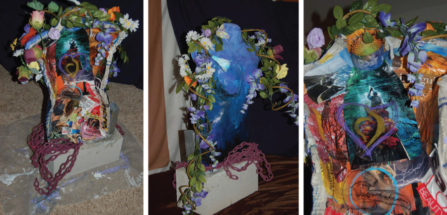
Blossoming Growth of a Beautiful Life
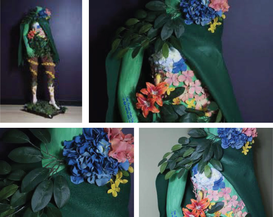
Artist: Bella Vita A Beautiful Life Psychology Group, Inc., Eating Disorder Treatment Center/CA
“The flower that blooms in adversity is the rarest and most beautiful of all.”—Walt Disney Company
“Blossoming Growth of a Beautiful Life” chronicles the dynamic journey of how an individual can once again be rooted, grow and blossom into one’s true self, although they live in a world where they are soiled to achieve an unrealistic standard of beauty. Daily, people struggle to find the answers that allow them to shift their standard of beauty to focus internally, not externally.
A variety of colors were used to represent the complexity and beauty of people and life: Yellow – the color of intellect, green – the color of growth and balance, pink – the color of unconditional love, turquoise – the color of communication, and blue – the color of trust. The cloak represents the wisdom and ability to protect or reveal one’s inner truth; once the inner truth is revealed, it radiates one’s external beauty.
“Blossoming” reminds us that true beauty does not lie along the curves of the body, but rather within one’s heart, where the flowers fully bloom. The curve of the body is no longer recognizable, removing all external focus of self. The flower petals move in a circular fashion from the lower half of the body extending towards the upper half, representing thriving growth. The flower, held in her hand, is a depiction of the beauty she now sees in herself, which she can now offer to others.
Materials:
Special thanks to PLACTbros., LLC, for making the donation of the mannequin, acrylic paint, silk flowers, plastic foliage, felt, moss, fabric paint, and rocks
Artist Profile:
“Blossoming Growth of a Beautiful Life” was a collaborative activity from The Bella Vita, A Beautiful Life Psychology Group, Inc., Eating Disorder Treatment Center in Woodland Hills, CA. The project was initially utilized as a therapeutic tool in Body Image group. Patients collaboratively created a theme and idea of what they envisioned the mannequin to look like and represent. Therapists, counselors, and administration staff further assisted with creating the mannequin.
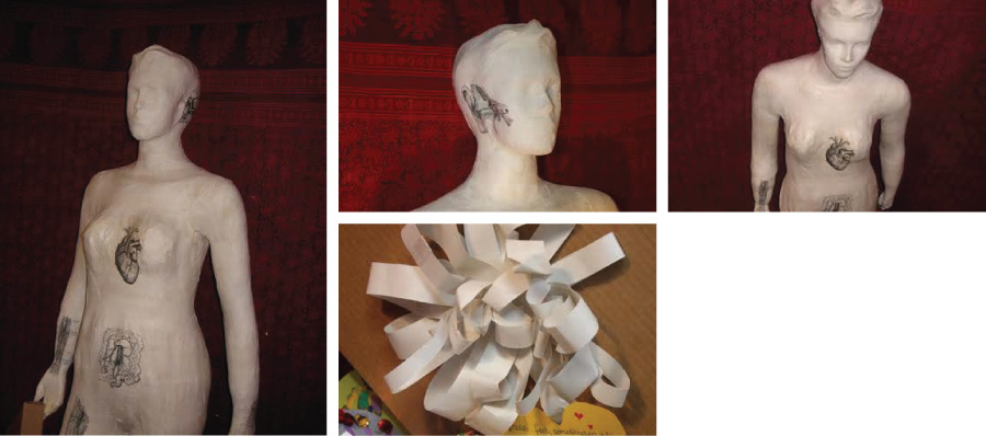
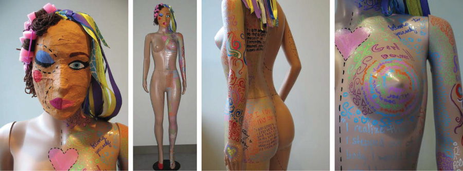
“Anatomy of a Genius” or “I Am”
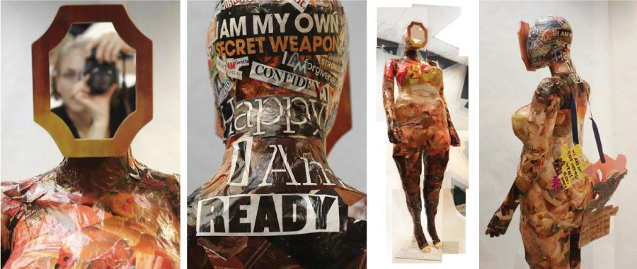
Artist: The Renfrew Center, Spring Lane Residents – PA, Rachel Braun, ATR-BC and Marcy Abhau, Art Therapist
This project began with the group unanimously protesting the fashion industry measurements of the mannequin and she was slowly transformed with layers of plaster and gauze to become a fertility doll of sorts; to celebrate reproduction and emphasize that which makes one physically a woman. A mosaic of skin tones was created to represent puzzle pieces as the group commented that this is an important aspect of recovery.
Character of the figure emerged through images and words: a map across one breast, a cat in a spa on the torso, an Olympic medal, “anatomy of a genius” plastered across the midsection, and the head filled with the exploration of “I am” an existential statement in itself. “I am growth, I am open sky, I am mystic wisdom, I am my own secret weapon.” The few original puzzle pieces became a shell from which the mannequin seemed to break free. These messages juxtaposed with undulating skin tones seemed to suggest a feminine force of tenacity and passion. Finally, a mirror was affixed to the visage of the mannequin as a way to invite or perhaps dare the viewer to identify oneself within this vision of body image and acceptance.
Themes that arose during the process included: the ability to redefine perfection as an illusion, “I am perfectly imperfect;” challenging one’s ideal body image while exploring character and what it means to be a woman; allowing oneself to be in the process in the present moment with faith that the end result would be as it should. Overall it appeared that these themes paralleled some of the recovery process and the mannequin itself became a vehicle by which to unite resident and bystander as one.
Materials:
plaster, gauze, magazine collage, mirror
Artist Profile:
Residents from The Renfrew Center, Spring Lane were invited to work on the mannequin project during open studios over a 15 week period. In all, two art therapists and 17 residents, women diagnosed with eating disorders and ranging in age from 15 to 50, contributed to the project. Just one resident was able to see the entire task through from beginning to end as the group continuously transformed as residents came and went.
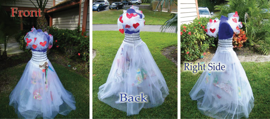
A New Day
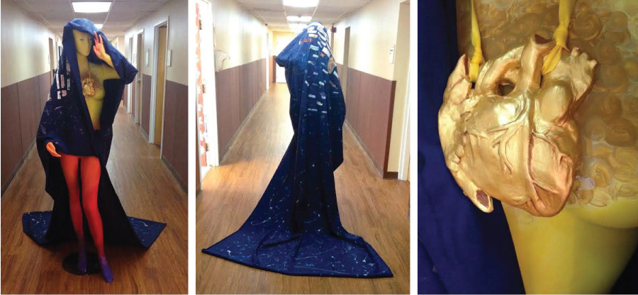
Artist: Reflections Eating Disorder Treatment Program at Dominion Hospital – VA
“I will love the light for it shows me the way, yet I will endure the darkness because it shows me the stars.”—Og Mandino
We’ve named our mannequin “A New Day”, as a metaphor of the healing process; peeling off the night from her body and breaking dawn from her heart. The night she is shedding consists of all the negativity, depression and chaos of her eating disorder. This is symbolized by the dark blue cloak, which is decorated with a collage of images and words which echo the eating disorder, society’s influences on the disorder, and the emotional anguish endured by the mannequin. Despite the darkness of the night, the stars and constellations shine through, representing the hope one must hold on to throughout the challenging days of recovery. The ‘new day’ symbolizes the soul of the mannequin, which should be seen at all times, regardless of her outward appearance. The gold heart shines through the darkness of the disorder and beams the light of recovery throughout her body; painting her in a blend of bright colors and marking the beginning of a new chapter in the mannequin’s life.
When we imagined the mannequin beyond what we saw, we imagined a resilient soul who had the strength to overcome her disease. We chose to emphasize that this strength is not solely physical, but spiritual as well. Though we painted the sun-heart on the mannequin’s body, we meant to convey the essence of the mannequin’s soul in a physical manifestation which could be seen by all. We dedicate this mannequin to all those souls in recovery … may we all shed the darkness of this disorder and discover our own New Day.
Materials:
Mannequin, acrylic paint, cotton cloth, air drying clay, magazine and newspaper clippings, mod podge, ribbon and tacky/hot glue.
Artist Profile:
The Reflections Unit at Dominion Hospital offers hope to adolescents and adults with eating disorders on both an inpatient and outpatient basis. Patients receive assistance from a multi-disciplinary team as they tackle, and overcome their eating disorders. This expressive therapy group, involving 14 women and 1 man, under the supervision and guidance of 3 expressive therapists, was conducted with the goal in mind to foster positive interaction with body image through a group art making project.
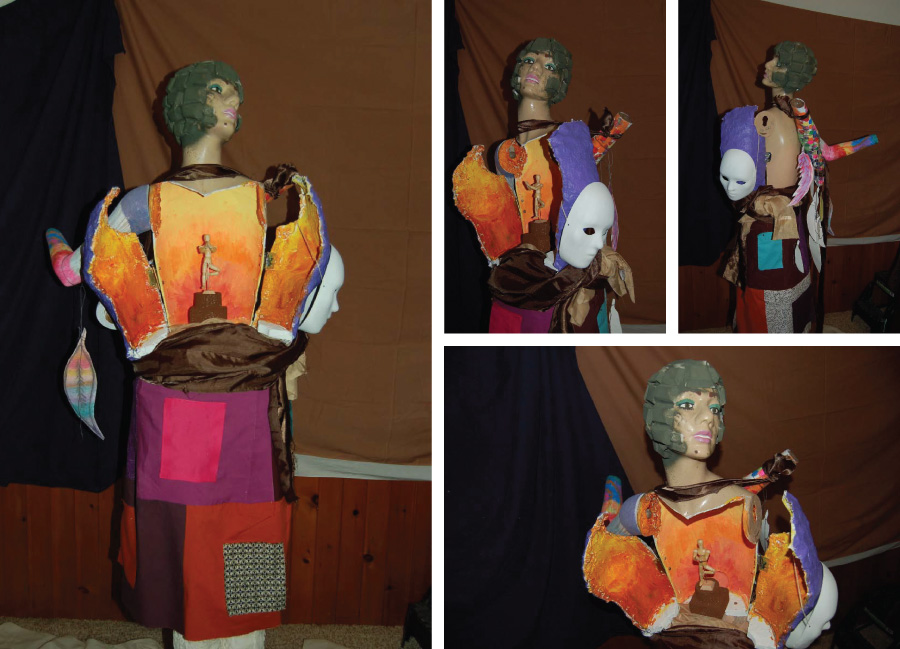
When I Remain Rooted I Can Fly Free (Fiona)
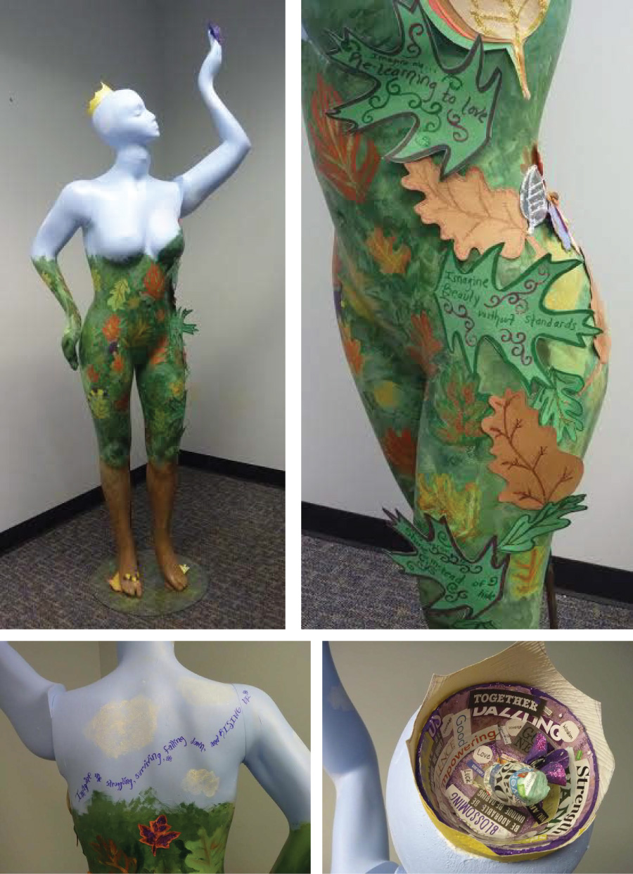
Artist: Art therapy group of Dr. Laura Riss, PsyD, Kaiser Permanente, Atlanta, GA
Our sculpture symbolizes our need to respect our roots as the armature of our growth, recognizing personal gifts and emotions as the basis of our true selves, grounding our struggle towards health. The project itself honored this through collaboration.
The roots at her legs develop into a stylized camouflage, representing our attempts to hide visually and emotionally. Oak leaves indicate strength and wisdom because of its longevity. Breaking free from the camouflage we reach up and take wing, symbolized by the clear blue sky on her upper body and the butterfly at her fingertips. One uncovered breast represents our struggle to embrace and celebrate our femininity.
Butterflies signify freedom after a struggle — metamorphosis and renewal. As the butterfly fights free of its chrysalis before spreading its wings, we have our own battle. The tableau inside her crown, representing our need to be important and special, depicts winning as wings emerge from a cocoon of negative words into a chamber of healthy perception.
Life events prompt our search for escape from our personal cocoons as seasonal changes like temperature and light trigger a butterfly to leave its chrysalis. Leaves from different seasons indicate that change as well as the incremental nature of recovery. We can find ourselves back to a “season” that we feel should have passed long ago.
Imagine me … struggling, surviving, falling down and rising up.
Beyond what you see is …
Green – A lifetime of happy moments, friends, children, laughing and playing, learning and growing.
Red – A lifetime of struggle and survival, of falling down and rising up, of overcoming and reacting
Orange- A lifetime of not knowing, but doing it anyway, of being confused, but taking action
Brown- A lifetime of dreams and bucket lists, of accomplishments, of awards and pats on the back
Materials:
Full Figure mannequin, fabric butterflies, Styrofoam head, wire, paint, paper, glitter, adhesive, acrylic putty
Artist Profile:
The five-member group working on this project are part of Dr. Riss’ current Inner Journey group. While the project evolved over several months, we have been part of her therapy groups in the past, so that some of us have known each other for nearly a year. This history gave us a deeper understanding of each other and let us work intuitively and comfortably together on this project. The other members of the current Inner Journey group contributed leaves and phrases created during one of our sessions. The butterfly has been an important symbol within our group and has figured heavily in earlier projects and discussions.
It’s Not Me, It’s You
Artist: Center For Discovery – WA
This is how they see me. Emaciated. Hollow. Nothing. They tell me what is beautiful, what is good, what is normal. And I believe them. And in doing so I become less than who I was meant to be. They dress me in styles foreign to my preferences, sell me products I wouldn’t normally use, and tell me how to behave in order that I may fit in. I am stiff and plastic and unable to resist as they dress me and fill me with ideas of perfection. No more. I will let you mold me no more. I will resist your influence and ignore your insistence that I must look and act and be a certain way. I have finally allowed myself to see what you have tried to do to me; how you have tried to shape me. But I know now that I shape myself. There is no part of me that needs adjusting or enhancing or perfecting. It’s not me, it’s you.
Imagine Me Beyond What You See got us thinking about who sees us and how they interpret what they see. Those who are close to us see us as good friends, artists, leaders, deep thinkers. But there is a bigger group of people, who don’t know us at all, and they see us in a very specific light. These people are Cosmo, Abercrombie and Fitch, and Kotex just to name a few. And we are tired of hearing what they have to say about who we should be. So we decided to tell them exactly how we felt. Hand-written letters and re-written magazine ads shout out our disapproval. Torn and twisted, they represent the distorted messages the magazines, clothing stores, and various brands feed us. This is our stand. It’s not us, it’s you.
Materials:
Hand-written letters from staff and clients to various stores, magazines, television shows and companies who perpetuate the thin ideal; Magazine ads – staff and clients ripped out ads from various magazines and re-wrote their messages to reflect the truth; Mod Podge – Matte; Sandpaper; Tape
Artist Profile:
Center for Discovery is a residential treatment facility for adolescents with eating disorders. Center for Discovery has locations across the nation, but this submission is from our Edmonds, Washington facility. Our facility is comprised of 25 staff members who contributed their thoughts for this project about how our culture, specifically media and corporations, is negatively impacting our clients, friends, families, and even us.
Hope
Artist: Center for the Sierras – Residential Treatment Program – NV
The work spanned the course of two months and saw many residents and patients lending their mind and effort to the pieces. Both groups chose the theme Freedom From Eating Disorders and both came to that topic independent of each other. While we found ways to draw inspiration from our source, the journey towards freedom and recovery does not follow a single path. The process of making the pieces was characterized by cohesion and dissonance. The interplay of the two was experienced throughout our art therapy groups as it pulled us together and shown a light on our differences. The meaning of the work resides in this process and the product remains a sum of our differences and the source of freedom sought by all. Although our inspiration was freedom from eating disorders, it can easily be seen as one journey with many voices.
From bottom to top Hope represents a journey to recovery. The bottom of the piece makes use of chains and triggering collage. as the piece works upward, color and collage become brighter and recovery minded. The final color settles on periwinkle the color of recovery. On the back are 2 organs a heart and pancreas. the pancreas serves to represent those suffering with diabulimia. The top of the piece is adorned by flowers to represent new growth.
Materials:
Mannequin torso, chicken wire, burlap, plaster, pipe cleaners, acrylic paint, latex paint, pastel, watercolor, coffee filters, notebook paper, tissue paper, wood.
Artist Profile:
The Center for Hope specializes in the treatment of eating disorders. The center provides three levels of care – a residential treatment facility, a partial hospitalization program and an intensive outpatient program. The center is unique in it’s expertise in the treatment of Diabulimia. The residential treatment program and partial hospitalization programs produced submissions.
Terrain
Artist: Center for the Sierras – Intensive Outpatient Program – NV, Michael Lospinoso
The work spanned the course of two months and saw many residents and patients lending their mind and effort to the pieces. We chose the theme Freedom From Eating Disorders. The meaning of the work resides in this process and the product remains a sum of our differences and the source of freedom sought by all. Although our inspiration was freedom from eating disorders, it can easily be seen as one journey with many voices.
As a result of the changing dynamic within the group the piece seemed conflicted and while the piece is wrought with symbols, a binding thread felt missing. The feathers represented our desire for freedom; The quilt, our desire for cohesion; The messages, our desire for recovery. Adorned atop of the head is a grenade which functions to communicate the explosiveness of thoughts associated with Eating Disorders. In the midst of thought the work does seem lost, but stepping back from the work, what seems evident is a whole, a work of many authors, a multitude of voices advocating for freedom and recovery, a compilation. At the core of the work is a figure in tree pose on top of a tree with a sunrise that rests inside of the chest cavity. This component was embraced by all that worked with on piece, for everyone it conveyed a desire for inner peace, a longing for recovery. Both dissonance and harmony resonate in this work, a work of beautiful complexity.
Materials:
Full mannequin, paper, pastel, spraypaint, chicken wire, burlap, plaster, fabric, hinges, acrylic paint, wooden figure, plaster cloth, foam, clay, wood.
Artist Profile:
The Center for Hope specializes in the treatment of eating disorders. The center provides three levels of care – a residential treatment facility, a partial hospitalization program and an intensive outpatient program. The center is unique in its expertise in the treatment of Diabulimia. The residential treatment program and partial hospitalization programs produced submissions.
No Time to Lose
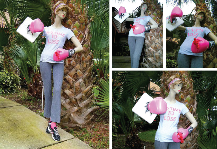
Artist: Fairwinds Treatment Center – FL, Melanie G. with Art Therapist Kathleen Sullivan, MAAT, ATR-BC
The bare mannequin came here as a discarded mismatch months ago. Not long after, so did I, feeling similarly discarded by earlier providers who deemed me hopeless.
For weeks, the treatment community was moving forward, but I was stuck, essentially still hiding.
Hidden in the art therapy closet was this mannequin, still deemed unusable. As the group adopted another, I asked to also develop this one individually.
I started repairs, got distracted, and then a spark of inspiration caused me to start over. The same can be said for my eating disorder treatment.
On a limited budget and short schedule, it was difficult to acquire what I first ideally envisioned. This led me to need to surrender that idea, and ultimately, pieces of myself, in order to make this happen.
Dressed in clothing from my own disordered life, the shirt bears the piece’s title- “No Time to Lose”. For so long, I’ve asked myself what that meant in relation to me. Through this artistic process, it came to mean two things – that I had no time to lose in developing my entry, but most importantly, that I don’t have time to lose any more than I already have from my eating disorder.
Another essential surrender was my scale, which my CEDRD would return only to be used artistically, which I’ve done here.
The boxing gloves represent years I’ve fought- whether for or against myself, with or against providers, or taking on my insurer for access to appropriate care I’m finally receiving. In treatment, I’ve fought through several difficult transitions, but now I’m flourishing under the guidance of these eating disorder professionals.
This is a fight that I’m finally winning, far beyond anything I’ve imagined or envisioned.
My life is waiting. I have no time to lose.
Materials:
Mannequin, acrylic paint, clothing, and other found objects representing disorder, progress, and recovery
Artist Profile:
At the time of creation, Melanie was a residential patient at Fairwinds Treatment Center in Clearwater, Florida. She credits many eating disorder professionals there for their patience and persistence in bringing her to the surrender stage of recovery, which is an integral concept used in her work on this entry.